Back to: Trial Questions
Question:
What type of graph is this, and explain what it shows:
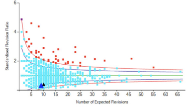
This is a funnel plot and it is a graphical means of identifying and displaying non-normal values, or outliers. Funnel plots are a scatter plot of values, such as the NJR Revision Rate, with superimposed ‘control limits’. The normal range is largely determined by the mean of the population group under analysis. In essence, all values arising from a normal distribution which should be expected from the same set of processes will fall within 3 standard deviations from the mean. An unusually high value compared to the rest of the group analysed will fall outside of the control limits, and therefore be deemed an outlier.
Answer